The next challenge was to design a credit card checkout form or page, including the important elements such as dates, security number (CCV) and card numbers. I was keen to apply this challenge to Eventbrite. As a regular Eventbrite user, I am generally satisfied with my experience, especially when it is easy to login and register with all my details intact. Nevertheless, when recently purchasing tickets for an event, it presented an opportunity to make the check out experience more simpler, consistent and easy to follow.
Before
Purchasing a ticket from Eventbrite initially appears straightforward and in line with most event e-commerce sites. Eventbrite provided regular feedback so the user would know when their choice was being processed at the the checkout cart or at the payment page. The language used overall is easy to understand which helps users recognise what each feature would achieve. Eventbrite also provide access to its help centre to resolve your ticket needs before and after your purchase.
Yet, further investigation revealed key opportunities to improve the user interface to minimise the impact that purchasing a ticket could have to the user's daily schedule.


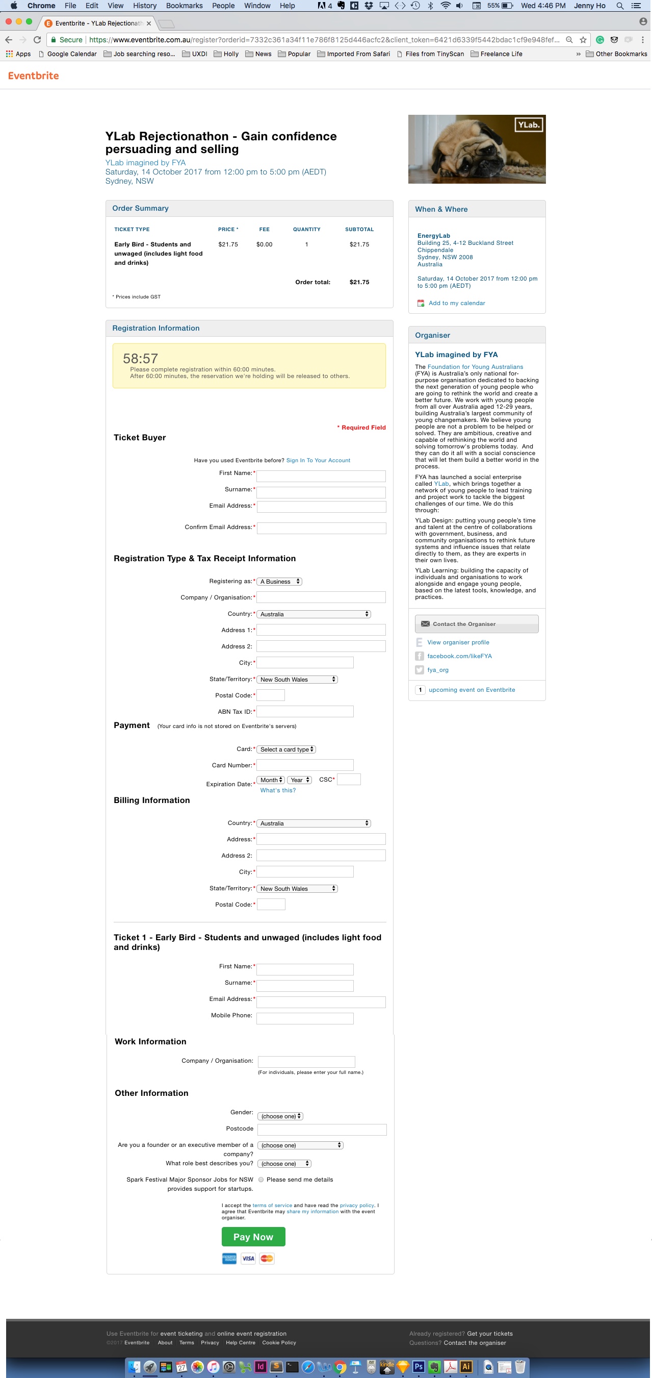
As you can see from these visual layouts, the checkout process features long one-page forms. One page forms can make the form process immediately dissatisfying to the user because its length makes the check out process more time consuming. This form's length increases, the more tickets you purchase.
In testing the website with users, as users complete the form beyond the form, they lose access to the order summary which forces users to recall these details by scrolling up and down this page.
In addition, this form has also include required fields that are the same which impedes the user's freedom to fill out this form more effortlessly . Whilst some of these reasons are outside Eventbrite's control, there are still design opportunities that Eventbrite can take to make these forms a less discomforting experience.
One of the largest drawbacks between the checkout pages in amongst the checkout experience is its visual inconsistency. The checkout pages a different font, different call to action buttons and features tables that are not present before and after the check out experience. In making all these pages more visual consistent, it would not make purchase an Eventbrite slightly jarring.


After
My design changes and my reasonings are numbered below.

1.
One of the expectations users would expect an event page to match their real world expectation is an way to contact the organiser for specific questions.
Eventbrite makes this available to the user but the contact feature is only available at the bottom of the event page, forcing the user to scroll to access call to action.
By placing the call to action to the organiser in easy view of the user such as position 1, it would allow more user flexibility and control.

2.
Splitting the original form into two parts helps users manage their initial expectation of the check out experience. These two parts are Ticket Registration and Ticket Payment.
In first displaying the Ticket Registration process, users can first focus on attaching the allocated ticketholder details to each ticket and then Ticket payment after registering tickets.
3.
Moving the Order Summary to the right hand side of the page provides a visual hierarchy for the users.
As the Order Summary and Organiser sections are boxed, it represents a constant element on the page. Also, allowing these sections to be constant yet floating elements helps users avoid losing sight of this information as your scroll down the page.

4.
A minor issue with the original Eventbrite Order Summary was its fixed quantity at the checkout page.
Other e-commerce sites provide that flexibility to change the update and update your order automatically. For Eventbrite, users would have to undo by going back a page, and redo the quantity and proceed to checkout. This process constricts the freedom of the user.
The design change that I have instilled here is a droplink attached to the quantity which automatically updates the number of ticketholders.
Here if you can the quantity from 2 to 3 tickets, another ticketholder place is added to the registration, which the user can complete within the same page.

5.
Long forms in Eventbrite mean that the Order Summary would be lost beyond the fold.
In this redesign, not only the Order Summary is placed on the right, but it is floating as you scroll.
The progress bar is key information can be be lost in scrolling is the Progress bar. Keeping the progress bar fixed as you scroll helps users recognise their surroundings behind the purchase.

6.
Ticket payment is the second part of the check out experience. It makes the original long form process more manageable. It also changes users perception to required fields as simply part of the experience, increasing their inclination to fill out all fields.
In activating the Ticket Payment section of the progress bar, it also indicates to the user that check out is a two step process and they are almost done.
7.
One of the key features to the check out experience is the timer. It ensures that the order is processed in reasonable time without jeopardising other user's opportunity to reserve tickets.
However, in the original design, the timer countdown is left aligned to the instructions with its container. It reduces the visual impact of the countdown. By positioning the content in the centre, it makes the feature more visually prominent.

8.
In the original Eventbrite confirmation splash page, you could only share this event through Facebook, which limits users to only one social media platform. In repeating the social media options found in the comprehensive confirmation page, it allows users to access more options earlier.